The Assigment
The goal of this assignment was to create a rebrand of the kombucha company we were assigned. We were tasked with creating a new logo, value prop, and mission statement as well as ways we could improve the company.
Company Story
Moody Culture was created by the husband and wife team, John and Lisa. After some national and international urban hotspot adventures, they experienced some excellent kombucha and they developed a craving. Unfortunately, or perhaps, fortunately, as they searched and searched the State College area, located in Pennsylvania, the only products that came close to giving their tastebuds an exciting ride were those mass-produced brands.
They decided to create there own. Their first few batches were minor successes, but with a few fine adjustments and experimenting, they arrived at what we thought was truly distinctive kombucha.
They asked their friends to be there first willing subjects and after just a few sips they continued to ask for more!. They then began giving away nearly everything they made and they had little left for themselves, it was time for them to increase production and start thinking about a business.
Research
In this day and age with all the rebrands in the world, extensive research is required to find a brand’s weaknesses and target the brand’s missed opportunities. By researching the company I was able to deduce what I can do to improve the brand. I put together a SWOT analysis to lay out all the information I gathered from my research into an easy to read manner.
Strengths
-Creative illustrations on every bottle
-Strong Mission statement
-Great photos of there product
-Wide variety of flavors
-Awesome social media posts
Weaknesses
-Weak website design
-The bland logo doesn’t get the message across
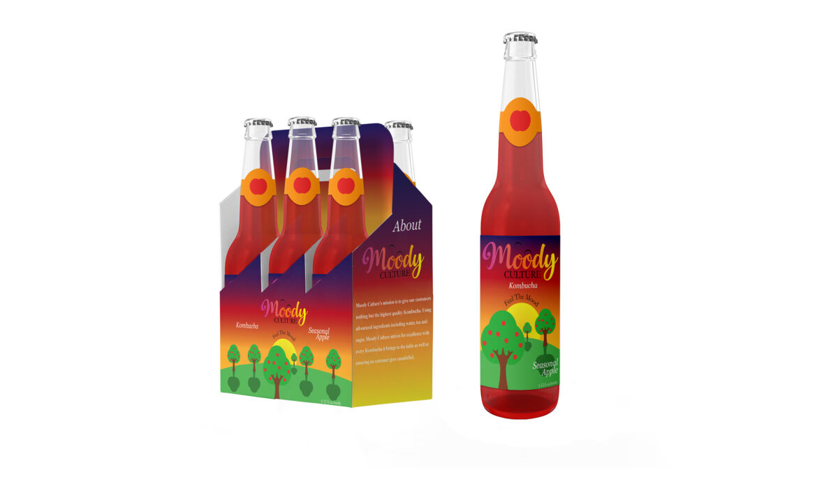
-The bottle used to package the drink is not enticing, looks like an old-style medicine bottle
Opportunity
=Need an improved logo that will better suit the company
=There website is very bland and boring it could use a lot of work to help show off the companies personality
=The bottles they use to package their drinks without a doubt need improvement they all look like old medicine bottles
Threats
-Other companies may have more welcoming and creative websites that help pull the audience in
-Because they are stationed mainly on the east coast they’re missing out on reaching customers from all across the country unlike other kombucha companies
Target Audience
-Kombucha Lovers
-Ages 18-40
-Mindful drinking
-Millennials
-People who are looking for an alternative to alcohol
New Mission Statement
Moody Culture’s mission is to give our customers nothing but the highest quality Kombucha. Using all-natural ingredients including water, tea and sugar, Moody Culture strives for excellence with every Kombucha it brings to the table as well as ensuring no customer goes unsatisfied.
New Value Proposition
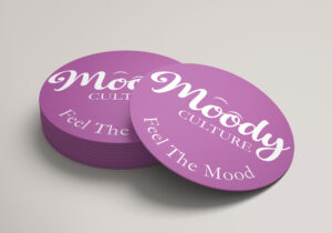
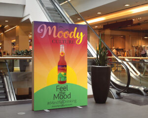
“Feel the Mood”
Logo Process
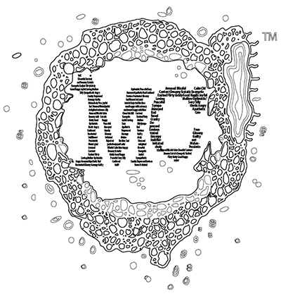
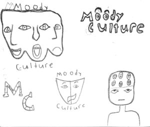
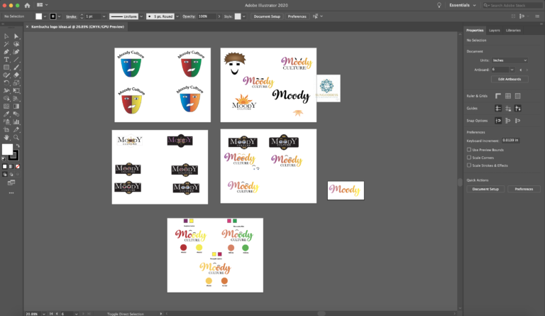
When it comes to designing a logo I always start with a pencil and paper. For Moody culture, I wanted to create something that spoke to the emotional theme of the company. After several sketches, I brought them into Illustrator and began to mix and match them with various colors to figure out the exact look and feel that I wanted.
I decided to go with a wordmark logo because I realized it was the best way to convey the theme of emotion to the audience. I used the font Superficious for Moody and Myriad Pro for culture. I loved the Superficious font because since it is a script font it already has the look of emotion because it is made by human hands.
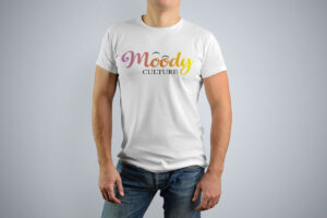
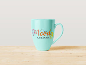
To further emphasize the theme of emotion I used a gradient overlay to incorporate multiple colors that represent different emotions. I also added two eyebrows over the two o’s in the word moody to create the look of eyes with eyebrows to give a facial expression to the logo.
