Ancella Pasta Brand Concept
Ancella Logo Creation
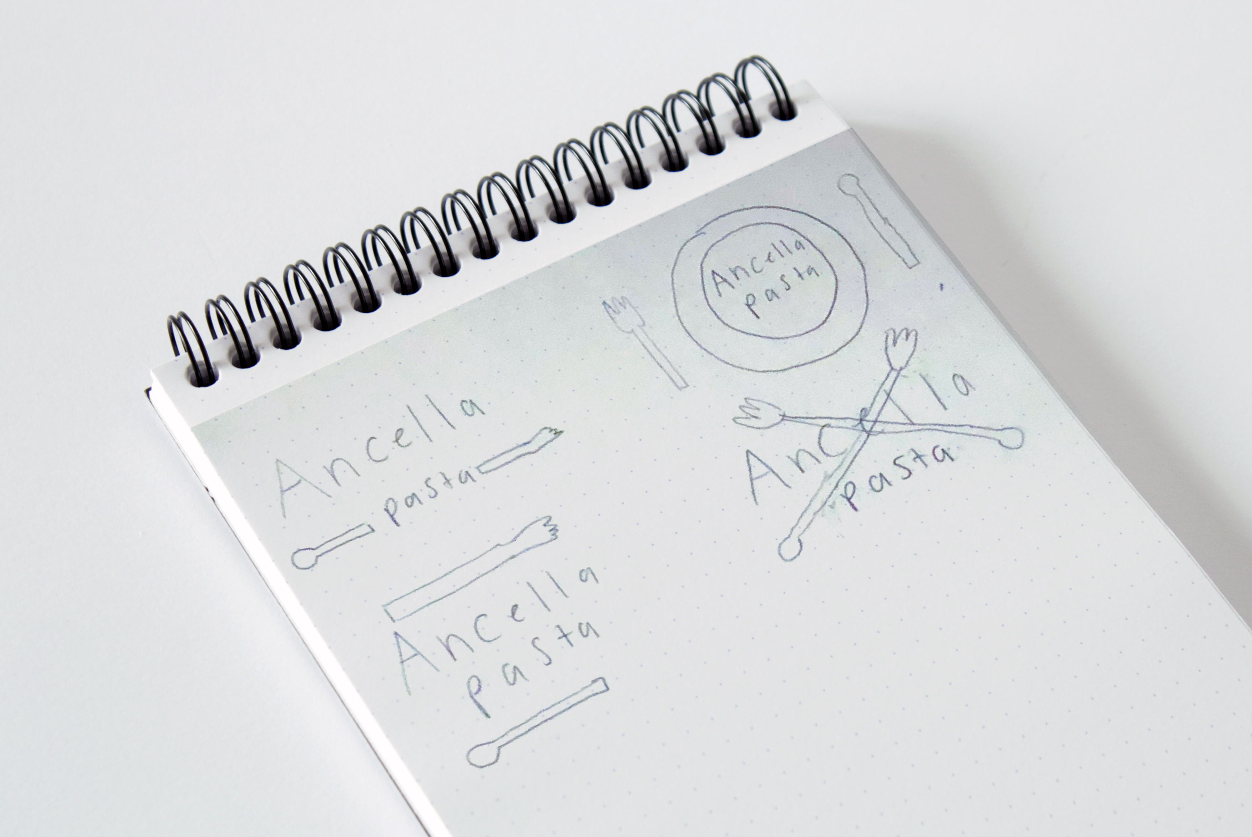
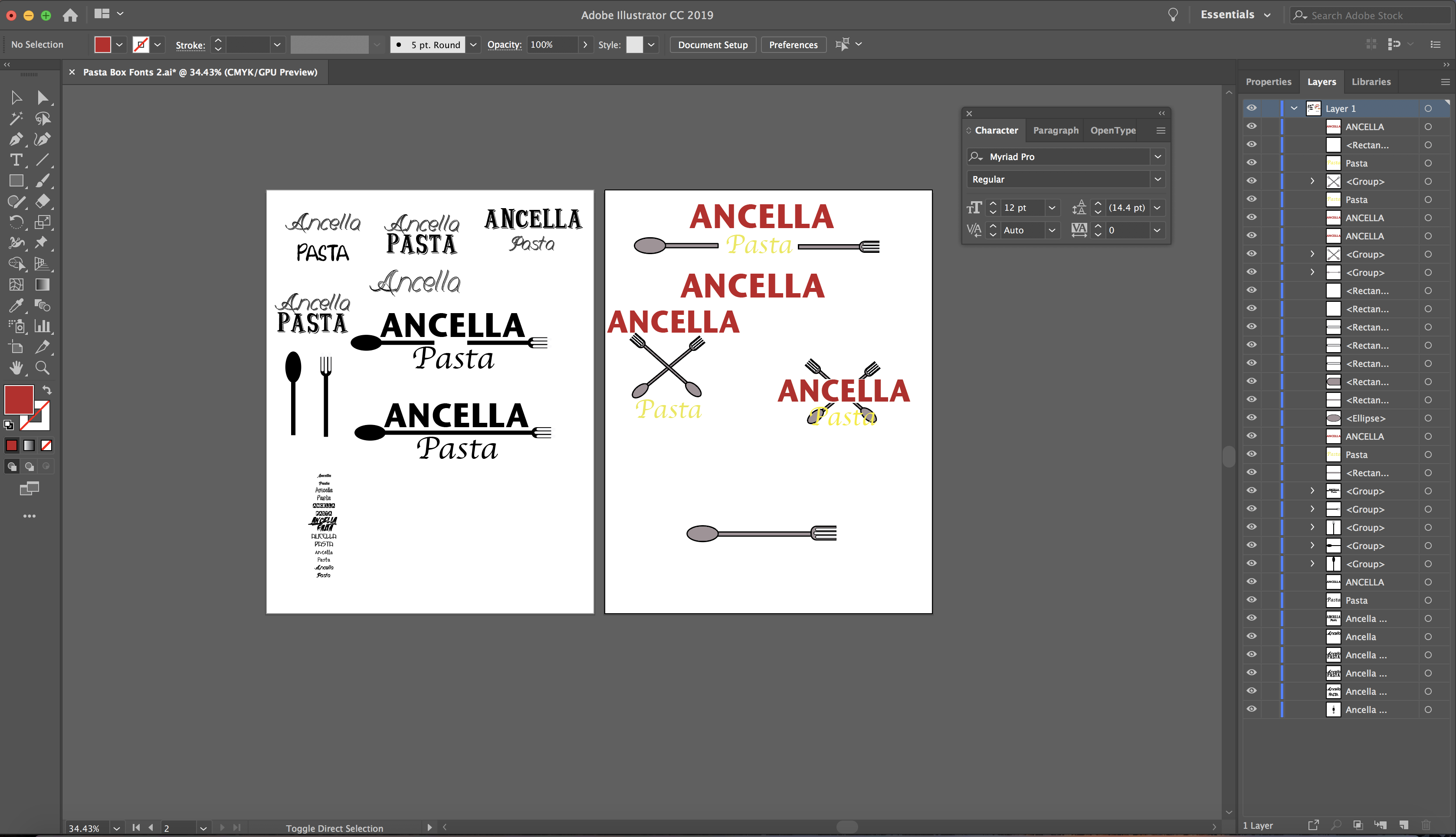
My designs always begin with a pencil and paper. Because this logo is supposed to be all about pasta I decided to create two objects for the logo that are used when cooking pasta, a fork, and a spoon. I made the spoon which is always used for stirring the sauce and the fork because it is the essential silverware for eating pasta. Once my sketching was complete, I moved on to the next step, which was creating the logo in Adobe Illustrator. I used a series of geometric shapes to create the spoon and fork for the logo.
Typography and Color
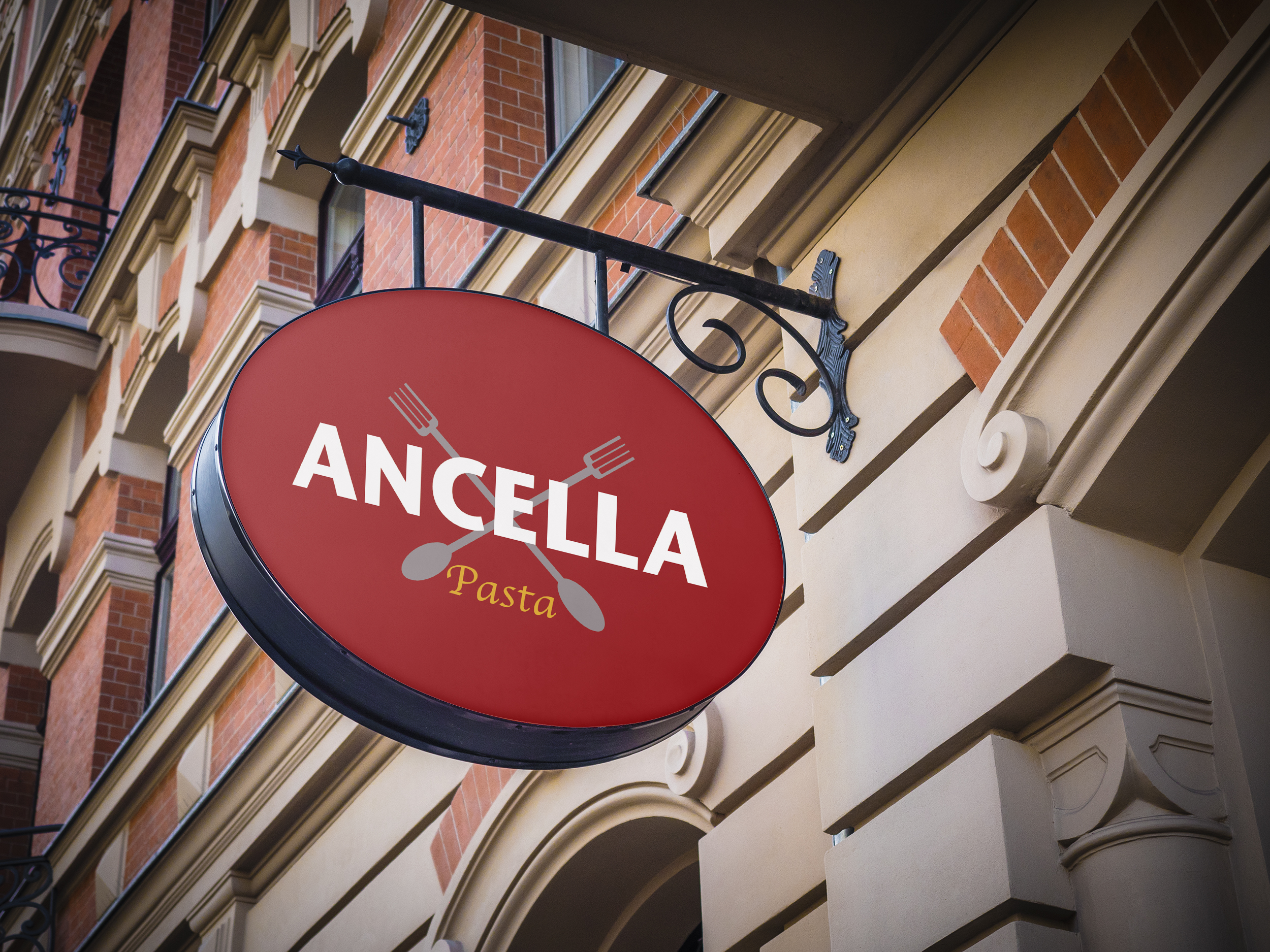
The fonts I chose needed to be strong enough to allow people to see what it says, but also to let them know that this is a pasta brand. I chose Stone Sans ITC TT Bold for Ancella to give it a bold statement and Apple Chancery for the pasta to give it that classic Italian look. For the colors, I wanted to choose ones that would correspond well to the subject of pasta. I chose a tomato sauce red for the background and a pasta yellow for the word pasta. For the silverware, I decided to give them a simple dark grey.
![]()
Package Design
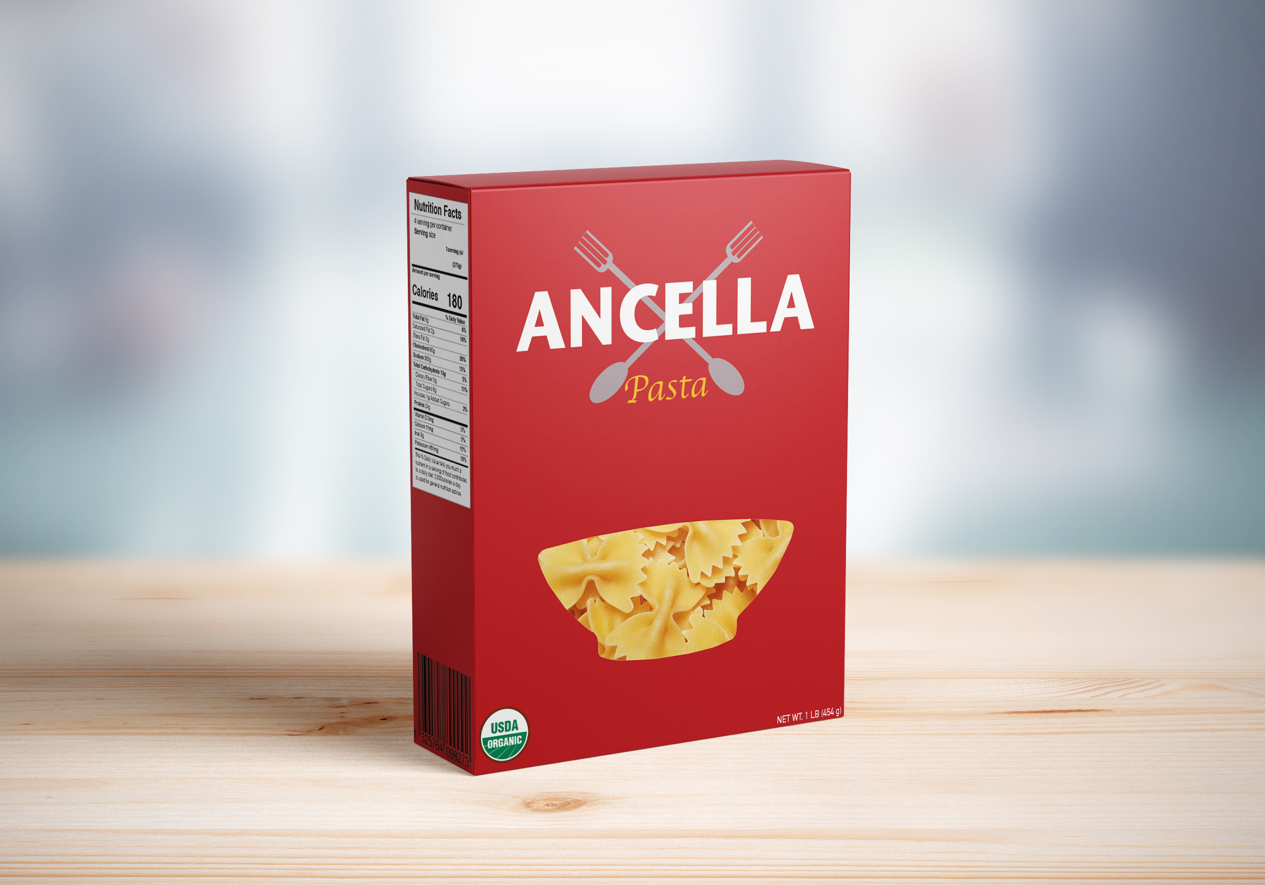
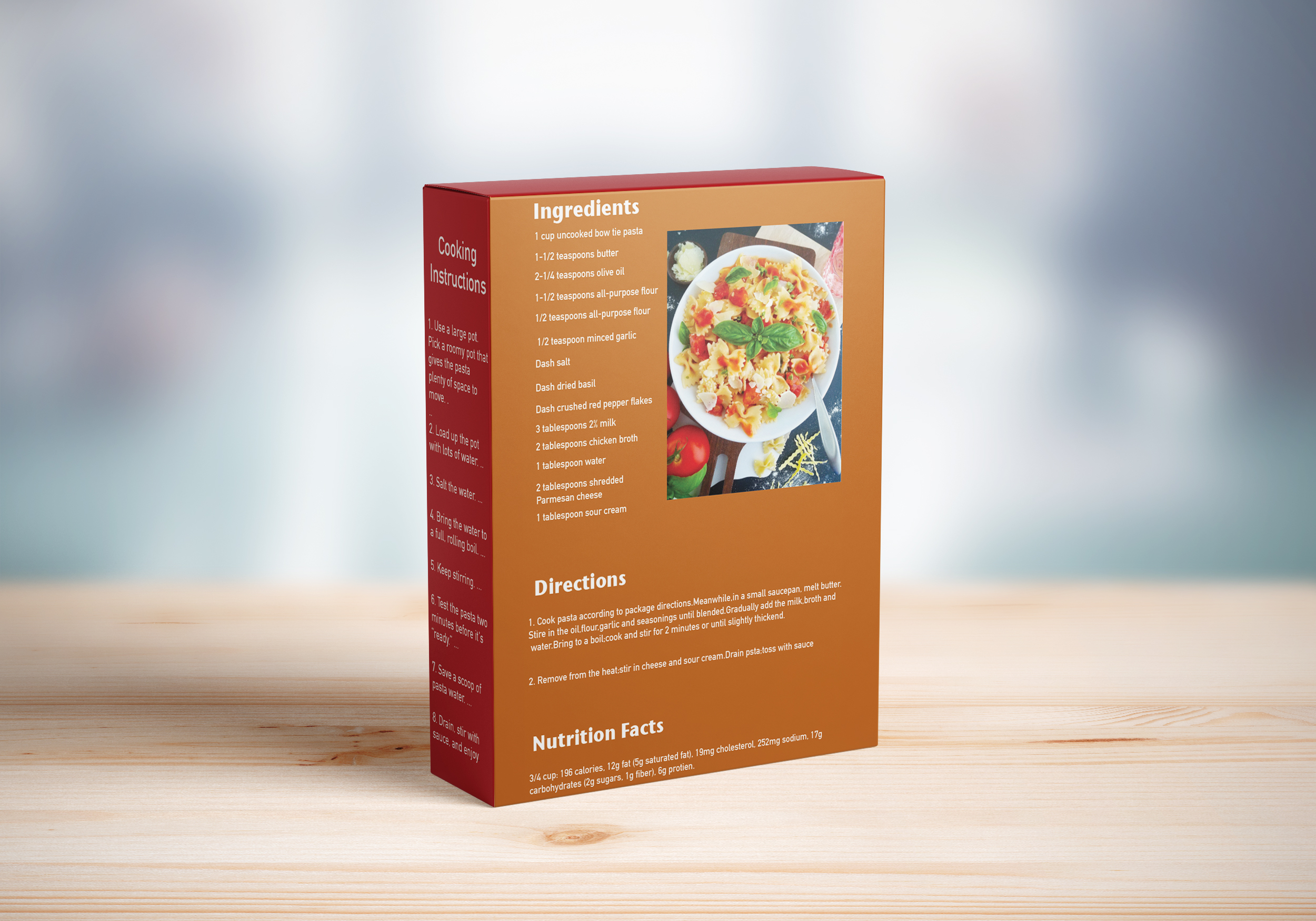
I created a package design that would further illustrate an authentic Italian pasta brand. For the whole package, I made sure to have my colors contrast, so they would capture the eye of the consumer. I even added a recipe for bow tie pasta to the back with ingredients and instructions to allow any consumer to try out a tasty dish using the pasta within the confines of the package. I also created a Nutrition Facts label with Adobe InDesign. (This is an original brand concept – there is no active website or social media).
Conclusion
My pasta brand concept taught me the importance of package design and the way it can influence a customer’s opinion. The use of typography, language, colors, and imagery needs to work together and send a message to the viewer. I explored packaging again with a coffee K-cup box design in my Allegro Coffee Case Study.
